Thursday 27 February 2020

Caran d/Ache Sunset

In my later years, I'm starting to see that although I had previously loathed pink inks, there are some that are quite nice.  Caran d'Ache's Sunset is at the top of that list for me.


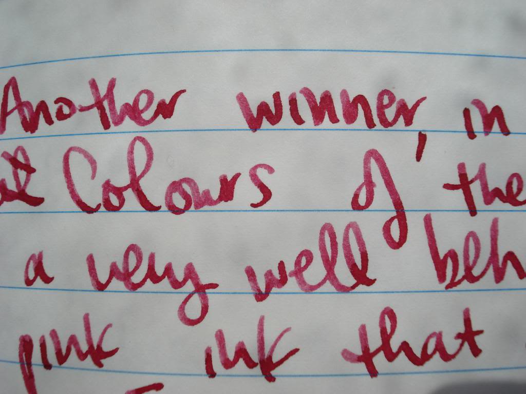
There is nothing I don't love about this ink.  It's well behaved on Rhodia and CF paper, and has amazing shading.


Overall, I can't say enough good about this ink.  The main downsides are that it is fairly expensive (usually about $21 USD + s/h for 30mL) and that it is discontinued (though it seems to be an unpopular colour of this brand, so there's lots left still online).


I will leave you with some writing samples to show off the yummy shading.  


Caran d/Ache Caribbean Sea

I like a lot of inks, I do, but this is definitely in my top five favourites.  It's got this shifting blue/green undertone that makes what you write seem enthralling and shading that keeps it interesting.  It looks AMAZING on Rhodia dotPad & CF paper.


Overall?  I definitely love it.  


Wednesday 26 February 2020

Caran d'Ache Saffron

I have an extreme soft spot for orange inks. I try out a million different shades looking for the perfect one and have now come up with a few that I really love. This one may have almost taken top prize when I sampled it a few days ago. I love shading in inks, and this orange shades more than any other I've tried. I wrote in the below review that writing with this ink is like writing with a flickering fire, and it really feels that way. I bought a bottle of this immediately after trying this sample.


The way the shading looks, it's almost as though you're using two different coloured inks at the same time, because the change in colours in the shaded areas is so dramatic.


Here are a few final writing samples:


Caran d'Ache Blue Night

The Colours of the Earth series has a few of my absolutely favourite inks.  This one is fine, but definitely not a big winner in my eyes.


As blue-grays go, this one seems a little bland to me.


Mainly because the colour in the areas where it shades lighter is SO washed out.


On papers that bring out the shading, it can look nice.


But generally I find it kind of boring.


As far as blue-grays go, there are plenty of other options with more pizzazz out there.


More writing samples:


Ink Reviews

This has been a long time coming, but I'm finally going to start working on migrating all my old ink review images over from Photobucket to this blog.  Ultimately, my goal is to update all the ancient ink reviews on FPN - those dead photobucket images are driving me nuts, and I put a lot of work ink ink reviews all those years ago.

So here goes ...